Visual Capitalist:
Image of the visualization;

Link to the Demographic:
https://www.visualcapitalist.com/top-20-countries-where-young-people-are-the-happiest/
What topic did you choose and why?
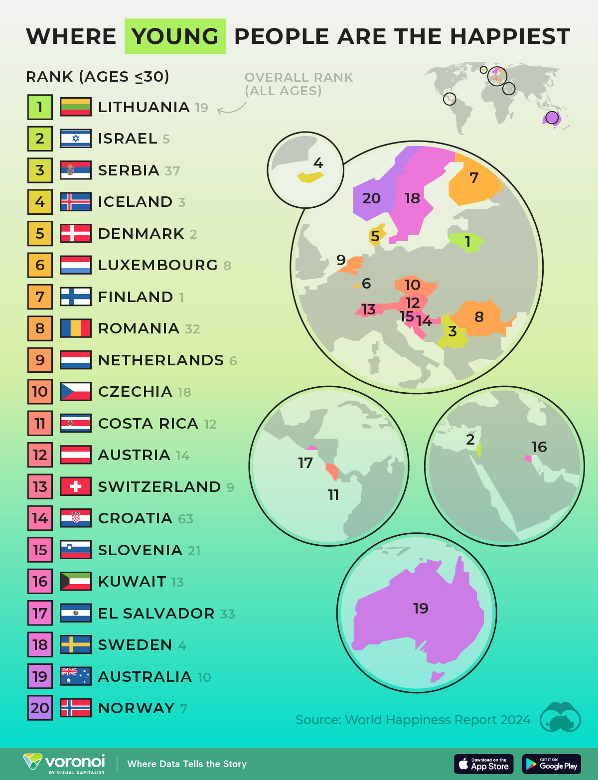
The demographic that I selected was “Top 20 Countries Where Young People Are Happiest.” I chose this topic because my home country, Serbia, was in the top 3. This was rather surprising to me, and I thought to use this demographic because Serbia isn’t often mentioned in media.
What type of visual was used?
The type of visual used was a ranking.
What does the visualization tell us? What type of information is given in the visualization?
The visualization shows a ranked list of the 20 countries where people under the age of 34 are happiest, and it also shows the geographical locations of each country.
What is the most outstanding part of the visualization? Did it catch your eye? Why or why not?
In my opinion, the most outstanding and eye catching part of the demographic were the vibrant colours used because it draws your attention to the information and makes it more visually pleasing.
After looking at the visualization, do you feel comfortable extracting data from it? Why or why not?
I do feel comfortable extracting data from it because it was very easy to read, and the information was nicely organized.
Describe where you think people would be able to use this data.
I think that people would be able to use this information to take inspiration from the ways that those countries operate in order to make their own population happier.
Bean Timelapse:
Below is a timelapse of the growth of my bean. Sadly, it doesn’t have as many photos as I would like for it to as I was away for a large portion of the beginning of my bean growth.
Bean Growth:
Bean Growth Chart:
