Visual capitalist:
Here are the questions for the project:
- What topic did you choose? Why did you choose it?
1a. Copy the direct link to the story you picked.
- Describe the type of visual that was used to get data across.
- In a few sentences what does the visualization tell us? Don’t copy the description given. You can paraphrase and add what you see.
- What type of information is given in the visualization? Be descriptive.
- Did the visualization catch your eye? Why or Why not?
- After looking at the visualization do feel comfortable extracting data from it. Why or Why not?
- What is the most outstanding part of the data visualization?
- Describe where you think people would be able to use this information/data. Give an example where this data may be relevant and can be used.
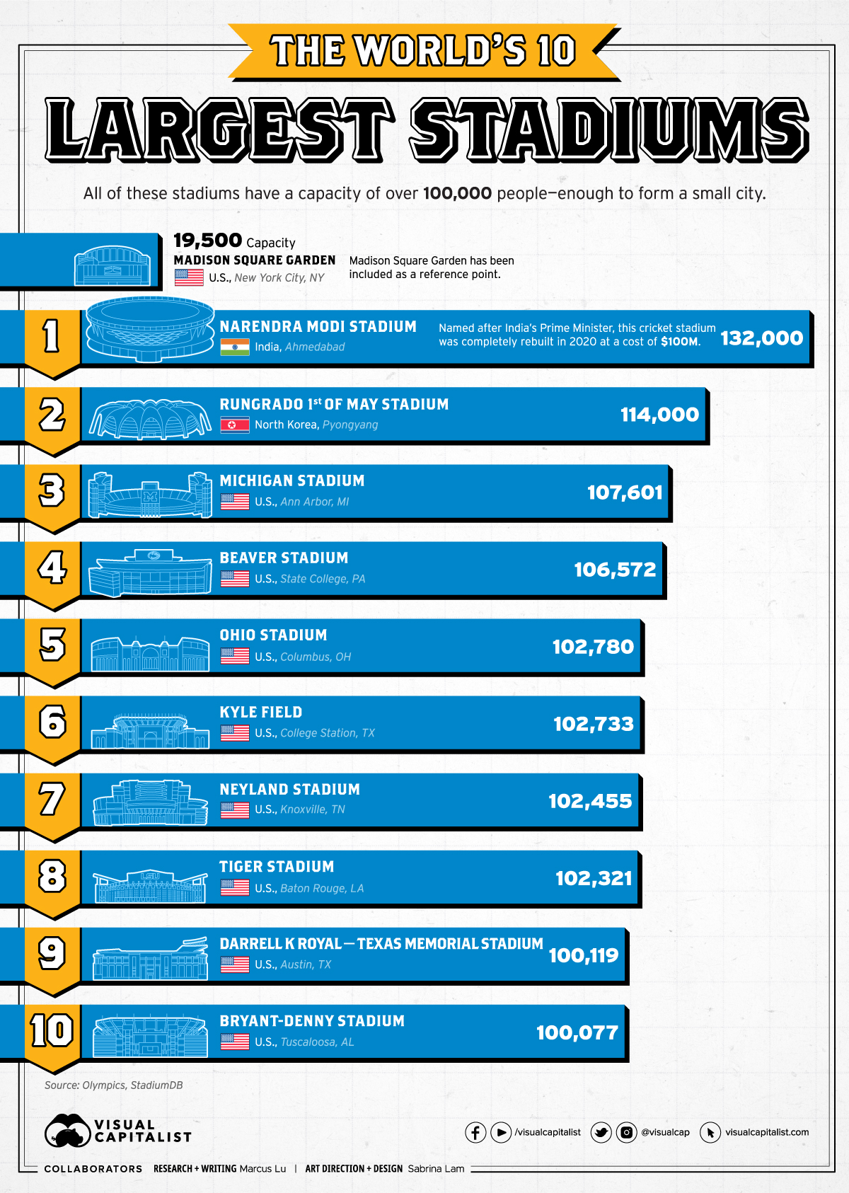
For my research I chose to use a graph on stadium sizes. I chose it because I liked going to soccer games with my family and I always thought our stadium in bc was big but I wanted to see how big could they get.
Here is the link to the story on the biggest stadiums.
The type of graph they used was a sideways bar graph with the stadium names on the bars the higher on the list it is in size and going right shows by how much bigger and gives the exact size of how many people it can fit as well. The visuals show us what the stadium looks like as well as the name and where it its found with the flag. The visualization catches my eye from the looks of the stadiums and the choice of colors. It is pretty easy to take data from because of the numbers given right too you and them being in a big font. The most outstanding part of the graph is that they managed to get what looks like good quality small drawings of the stadiums. People could use this data to see how easy it is to get a seat in the stadium for big games and seeing if you need to wake up early to get tickets.
Finally here is the Graph that I was looking at:

Bean Growth Project:
Over the last month are steam class has been growing beans in are math class watering them every 2 or 3 days. From this we each got 2 beans and for most people only one bean really thrived. We made an excel chart on the growth as shown below as well as a small time laps video.

If you want to see the chart or download it for any reason here is the link: Book 2.xlsx
This is the time-lapse I made of my bean: Bean Time-lapse